Color is the first thing a consumer will notice about your brand and that color influences 60% - 80% of a customers purchasing decisions. It costs a business next to nothing to choose colors for their brand but making the wrong decision, can make or break a product. Color is a powerful thing and I will show you how to choose colors for your brand.
Prefer video? Watch 'The Power of Color, How to Choose Color for your Brand' on Skyberry's YouTube channel.
Colors evoke strong emotions
Color may seem like one of those trivial things and is often not given much thought by new business owners. A new business owner may choose a color for their brand simply based on the fact that their favorite color is yellow, so they want their logo yellow. This is a critical mistake and I will help you gain a better understanding into the world of color, how color evokes strong feelings in consumers and how colors impact your brand. The key to choosing color is to understand these emotional responses."Color is an integral part of your brand. This color must be integrated across the board to achieve the highest impact." Tweet this
The color you choose, will be used in your logo, your website, your products you sell, your marketing materials, your promotional giveaways, in everything. Did you know, 85% of shoppers buy a product solely based on color? And color increases brand recognition by 80% when used well.
How to choose color
Consumers have strong reactions to color and each color elicits a different emotional response. Based on many studies throughout the years, not every color is suitable for every business. Designing with color is a sensitive work of art and requires a tremendous amount of thought and research to achieve positive results.In order to choose color, we must understand the potential emotional responses each color may convey to your consumer. Once we understand the emotional response, we will know what colors may be suitable for your brand.
Red
Evokes passion and increases your heart rate. It is attention grabbing, provocative, and seductive. A popular choice for food, technology, automotive and agriculture. It is questionable for healthcare as it can remind people of blood, and finance thanks to the saying "in the red".Purple
Sophisticated and mysterious. It has royal connections and an elegance about it. It is spiritual, emotional, and soothing. A popular choice for finance, technology, and healthcare.Blue
Arguably the most popular choice for a brand. It is thought to put people at ease because it reminds them of blue sky and the ocean. It is trustworthy, dependable, secure and responsible. It is popular for most all industries except food because blue is a known appetite suppressant.Green
Eco-friendly and calming. There is a wide range of emotions evoked from green depending on the shade used. Dark greens are associated with wealth and prestige, while lighter greens are serene and fresh. It is a popular choice for finance, technology, food, and agriculture.Yellow
Bright and filled with hope and optimism. It reminds us of the sun and stimulates energy and creativity. It is positive and motivating however, yellow is best used in small amounts as too much yellow can overwhelm a person - making them anxious. It is popular for agriculture, food and entertainment. It is a questionable choice for retail and finance.Orange
Combines the cheer from yellow with the energy of red to make a color that is playful, exciting, and fun. Orange ranks the lowest among all age groups and genders in favorite color studies. It is popular for technology and healthcare. It is questionable for automotive and finance due to its generally low likability.Brown
Earthy and strong. It has deep roots and is durable, however, it is a hard color to use unless applied by an expert as it can also easily remind people of dirt and filth. It is natural and ancient. It is popular for retail, agriculture, and food. It is questionable for healthcare because of the dirty angle.Black
Sophisticated and powerful. It evokes the feeling of luxury and prestige. It is timeless, valued and strong. It is popular for retail, technology, automotives and real estate. It is questionable for healthcare and food, as it is also associated with death.White
Purity in its truest form. White is clean, noble, innocent and soft which makes it a popular choice for healthcare, retail and child-related businesses.Choosing color based on your target audience
Your target audience should also be a consideration when choosing color, as different age groups and genders have strong preferences on color.Gender preferences
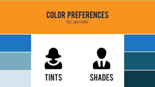
Females are often drawn to blue and purple and generally dislike yellow. Meanwhile, their male counterparts are attracted to red and green and generally dislike brown and purple. Men also prefer shades (black added) and women prefer tints (white added).Age preferences
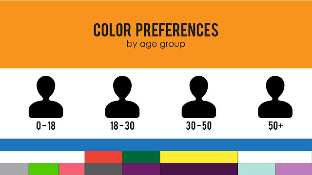
Age groups universally prefer blue, while youths and elderly strongly prefer white. Ages 18 - 30 have a strong draw to red and green. Ages 30 - 50 seem to really like yellow. Elderly often prefer pastel tones, especially in cooler colors like blue and purple.Embrace color
Successful use of color in a brand has amazing results and offers brand memorability (80% increase in recognition) in a way that imagery alone cannot offer, especially if the color is chosen well for the brand and used consistently throughout all media associated with the brand.When starting a new business, take the time to choose colors you think work well for your brand or consult a professional. Think beyond colors you like personally and choose colors your consumers will like and colors that say something positive about your brand. A branding expert will be able to guide you in choosing the best color for your brand.
The power of color
95% of the worlds top 100 brands use only one or two colors and less than 5% use more than two colors. T-Mobile is an excellent example of a brand that has used color successfully, with their bright fuchsia pink we see, any time we see their brand. Or perhaps you have seen that color somewhere else, on a t-shirt or a coffee mug, and your mind thinks of T-Mobile. That is the goal of an effective brand color - to remind consumers of their brand, even when they aren't looking at it. Choosing one or two colors is the start to a successful brand, so how do you choose a color? |
| T-Mobile branding using fuchsia, from logo to store to website and beyond successfully. |




No comments:
Post a Comment